I redesigned one of Planview's highest-traffic sections of the Customer Success Center by reorganizing a complex Professional Services portfolio around the customer journey. Through information architecture, content strategy, and UX writing, I transformed a disconnected service catalog into a clearer path for enterprise customers to understand their options and request the right engagement.
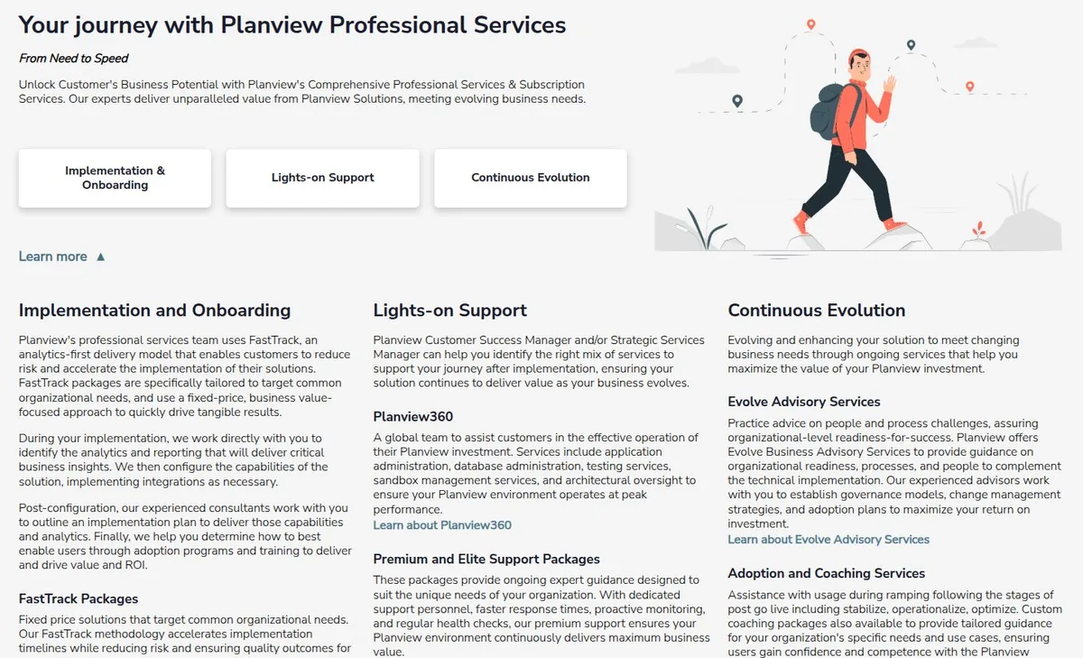
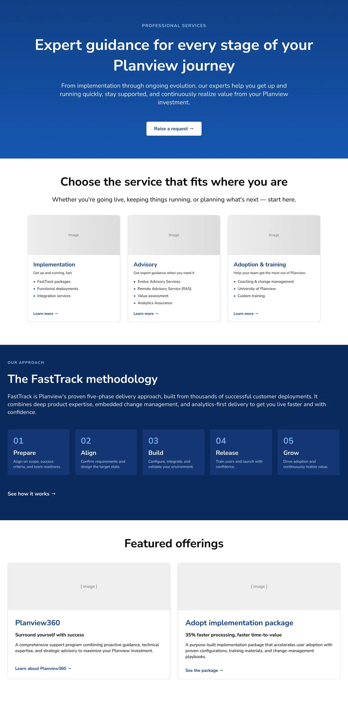
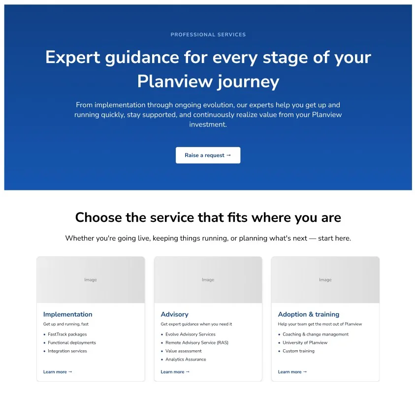
Professional Services section redesign, full experience view. Scroll to explore ↓
Planview's Professional Services section was one of the most-visited areas of the Customer Success Center, but it had become increasingly difficult to navigate.
As Planview expanded its Professional Services offerings, the section evolved into a catch-all for implementation guidance, advisory services, subscription offerings, training, support resources, and promotional content. Each addition supported a legitimate business need, but together they created an experience that had grown without a clear organizing structure.
Customers arrived with a straightforward question:
What kind of Professional Services engagement do I need, and how do I request it?
Instead of a clear path, they encountered overlapping offerings, internal terminology, and content organized around Planview's service catalog rather than their own needs.
The information architecture reflected how Planview managed its services internally, not how customers made decisions. My goal was to reorganize the experience around the customer journey, making it easier for enterprise customers to understand their options, identify the right engagement, and take the next step.
Before

After

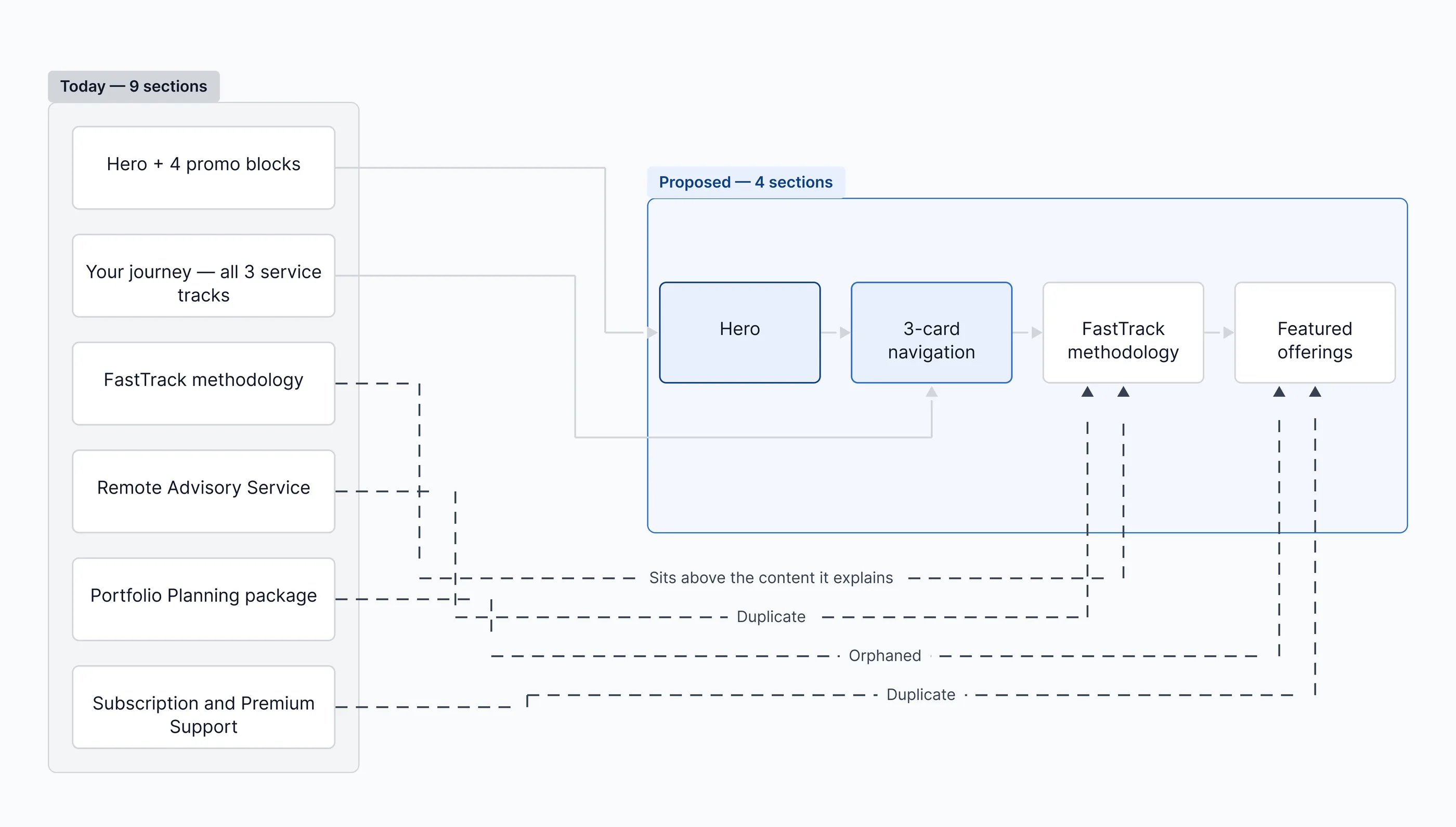
I began with a heuristic evaluation and content audit, mapping every service, heading, link, and call to action across the Professional Services section to understand what customers were being asked to navigate. To accelerate the audit, I used Claude to organize findings, identify recurring patterns, and explore alternative information architectures before validating recommendations with stakeholders.
The audit revealed an experience that had grown organically over time. Multiple teams had contributed content independently, resulting in duplicate information, inconsistent terminology, overlapping service descriptions, and no clear mental model for how the portfolio fit together.
Several patterns emerged:
No guidance based on customer journey
Customers evaluating implementation services saw the same experience as customers looking for long-term optimization, with little guidance for identifying where to begin.
Internal terminology required translation
Names like FastTrack, Remote Advisory Services, and Planview360 assumed knowledge most customers didn't yet have. Before they could evaluate a service, they first had to understand what it was called.
Organization reflected the business instead of the customer
The experience mirrored Planview's internal service organization rather than the way customers described their own goals.
Calls to action lacked consistency
Even after identifying a relevant service, customers weren't always given a clear next step.
As stakeholders reviewed the proposed journey model, we refined where services belonged, clarified terminology, and adjusted content hierarchy to better reflect both customer expectations and business priorities. Those conversations helped shape the final information architecture and reinforced that the underlying challenge was structural rather than editorial.
The central design challenge was helping customers understand a complex portfolio of services without requiring them to first understand Planview's internal organization.
Rather than organizing the experience around the service catalog, I reorganized it around the customer journey.
Working closely with stakeholders, I developed a three-stage model that reflected both the Professional Services team's understanding of the customer lifecycle and the way customers described their own needs:
Customers didn't arrive looking for FastTrack or Planview360. They arrived thinking, "I'm implementing," or "I want to improve adoption." Organizing the experience around those questions reduced the amount of interpretation customers had to do before finding the right engagement.
As the journey model evolved, I used Claude + Figma MCP to rapidly explore alternative navigation structures and content hierarchies before evaluating each against stakeholder feedback, customer mental models, and the constraints of the existing CMS.
The journey model became the organizing framework for every design decision that followed, from navigation and page hierarchy to messaging, content structure, and calls to action.
The new information architecture established the framework, but making the experience understandable required rethinking the content itself.
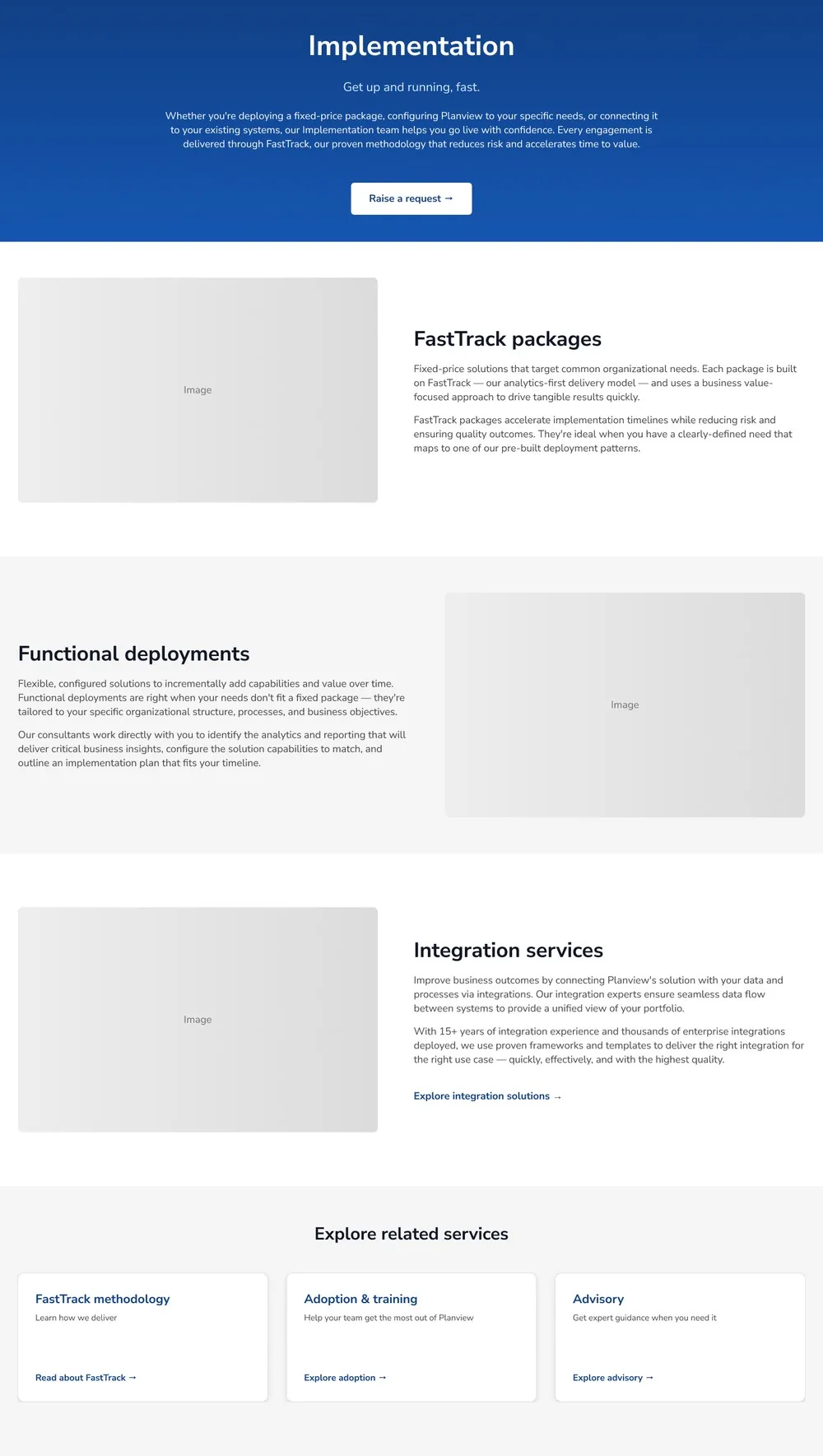
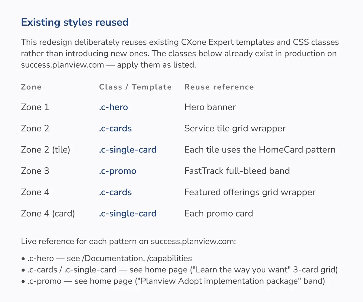
I rewrote service descriptions using plain language, leading with the customer problem each offering solved before introducing internal program names. Every page followed a consistent content structure so customers could quickly understand who a service was for, why they might need it, and what to do next. This improved information scent while making services easier to compare.
Calls to action were standardized throughout the experience, creating predictable pathways that helped customers move from understanding an offering to requesting an engagement.
Throughout the project, I worked closely with Professional Services stakeholders to ensure the content remained technically accurate while becoming significantly easier for customers to understand.
I also used this workflow to rapidly prototype reusable components, generate interface concepts, and explore alternative page layouts before refining them into production-ready designs. This allowed me to compare more design directions early while focusing my time on validating decisions with stakeholders and ensuring the experience remained technically accurate.
Implementation subpage design, showing how plain-language descriptions and a consistent content structure were applied at the detail level. Scroll to explore ↓
The redesign transformed a disconnected service portfolio into a guided customer experience centered on customer goals rather than internal organizational structure.
Journey-based navigation, consistent content patterns, clearer information hierarchy, and standardized calls to action made it easier for customers to understand their options, identify the services most relevant to their situation, and confidently take the next step.
This project reinforced how closely information architecture and UX writing depend on one another.
The services themselves weren't overly complex. The complexity came from how people encountered them.
Good UX here didn't mean adding more information. It meant organizing the experience around one simple question:
Which of these is right for me?
My role was to preserve what made each offering distinct while removing the complexity that made the portfolio difficult to navigate.